As an entrepreneur starting a new business (or rebranding an old one), you are likely chewing over the idea of getting a new logo design for your brand. If so, you’re probably also brainstorming over what makes a great logo design. Well, how about we knock our heads together and see if I can share some knowledge with you.
I have come across a wide variety of logos – it’s inevitable if you live in Lagos, Nigeria. While some logos are more impressive than others, they all have one thing in common. They make some sort of impression (no matter how small) as compared to businesses without a brand identity.
What most business owners, unfortunately, don’t realize is that a brand logo is more than just a cool artistically visual image they stamp on their products/services. It’s a representation of your business that is supposed to evoke positive emotions from customers. Customers should be able to brag that they would always choose “Brand A” over “Brand B”.
As an entrepreneur who knows the importance of a great logo design, you could fall into the trap of choosing a logo that doesn’t represent your brand at all. Note that there isn’t any such thing as a “best logo in the world” (one man’s meat is another’s poison after all). A great logo design should make your customers feel the way I feel when I walk into my preferred cinema house or restaurant – just great.
“Good design is good business.”
Thomas Watson Jr., businessman, second president of IBM
Keeping this in mind, if you have commissioned a graphic designer to dream up a logo for you, here are 7 qualities to consider before you say an excited “Yes” to the final product.
1. Is your logo design simple and easy to remember?
If you are represented with an image of a mermaid with a machine gun doing a backflip over a bridge, then your graphic designer is probably a newbie trying really hard to impress you. Think about it. How many of your favourite brands have logos that you can’t draw on paper?

It’s easy to fall into the trap of trying to look awesome. Remember to use the rule of K.I.S.S. when creating your brand logo (Keep It Simple, Stupid).
“Make it simple, but significant.”
Don Draper, fictional character on Mad Men
2. Is your logo versatile enough to use under any circumstance?
As a web and graphic designer, I have faced situations where I had to import a logo into a design (a website, flyer, or magazine). Some of these logos could not be resized without getting blurry or pixelated and some others blended into their background.

With great logo design, I can always resize freely to be clear and sharp on a billboard. I can also turn all colours to white so the logo doesn’t disappear on a dark background. Simply put, a great logo is one that can be manipulated to suit any presentation format without losing its symbolism in any way. Be it large or small size, print or screen, TV or mobile device, that logo will always look great.
3. Is your logo distinct?
While your logo may take inspiration from some other logo, ensure that it is distinguishable from the inspirational source. Your logo needs to be distinct in a way that your customers don’t mistake it for the other or you’ll lose your brand identity before even starting a business.


4. Is your logo design appropriate?
Ask yourself if the logo represents your business. Would your customers proudly flaunt it to their colleagues? Does the logo give a hint about what your brand does or how it does it?

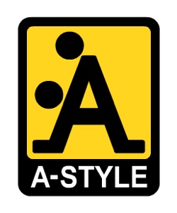
Considering an inappropriate logo, you also need to be certain your logo doesn’t offend anybody. It might not be intentional but there might be some sort of oversight. That oversight could result in you (and your designer) missing a gimmick that should have been a clever play on letters or shapes but ended up as a disaster to be laughed at for ages. Try asking colleagues what they think.
5. Can your target audience relate to your logo?
Contrary to the usual misconception, a logo isn’t made for you. It’s made for your audience (potential customers). As mentioned earlier, your brand logo is intended to evoke a positive emotion in them. This is only possible if they identify with the logo somehow.

It would be a horrible mistake to use a logo meant for women’s fashion on a toy for teenage boys. The same applies the other way too. Choose carefully about what your audience likes and you will get them attracted to your logo naturally. Above all, have your logo designed with your brand personality reflected in it.

6. How memorable is your logo design?
This takes us back to a logo needing to be simple. You have to admit that it’s a lot easier to remember a simple logo than one that looks like a map of a zoo. And guess what, all your favourite brands do have simple (and easy to remember) logos.

Even if you can’t tell whether your logo is going to be memorable or not, it’s a good idea to look at what successful brands did with their logos and follow their example.
7. Is your logo design timeless?
It can be tempting to incorporate a current trend into your logo design simply because you think it will instantly get the attention of your audience. Beware though, most trends are fleeting and once they pass, your logo will end up looking outdated.
While a lot of successful organizations tend to rebrand occasionally, you must note they do it to keep up with changing tech and not because their logo was outdated. Having a logo that is deemed outdated because it relied heavily on a trend can be a bad blow to your brand.
I remember dissuading a client from including a figure doing the “dab” pose in their logo for a dance school. I understand he believed everybody would be talking about it but where would that have left him now?
“Styles come and go. Good design is a language, not a style.”
Massimo Vignelli, Italian designer
Conclusion
Getting that great logo design for your new brand can be an exciting phase of the setup process. While choosing a logo is one thing, choosing a logo that will contribute to your brand’s success is another thing. Keeping the above seven qualities in mind, however, should make that choice an easier one.
You can also leave the choice to us at Imageazy Designs by making an order for a Corporate Design today.
Take a moment to think about your favourite logos and share what you think makes them so memorable in the comment section below.
Sources
- https://blog.hubspot.com/marketing/design-quotes
- https://www.smashingmagazine.com/2009/08/vital-tips-for-effective-logo-design/
- https://www.awwwards.com/99-creative-logo-designs-for-inspiration.html


I just read this blog post. It’s a vey helpful and informative blog for all those who wants to design their logos which looks more professional for their business.
We provide the best available service of logo designs designed by the top experts and professionals at
https://designingbase.com